Being an indie business means that I wear a lot of different hats. One that I struggle with is the "photographer" hat, and I've tried a lot of different setups over the years. But it's only recently that I've found a setup for yarn photos that I like, so I wanted to share that with you for this newsletter.
When I first started taking photos of my yarn, I wanted an "interesting" background. I had bought an Amish-made basket from Woolgatherings a few months before that and thought it would make an interesting backdrop.
But I noticed that the pictures were pretty dark overall, and when all placed together on the same website, the overall color was just "dark" which de-emphasized the bright colors of the yarn.
A few people suggested that I use the typical white background for the pictures. I resisted. But it wasn't just because I wanted to be different. It was because I thought getting good white background photos would be a ton of work, involving light boxes and special lighting and whatnot. I've tried that in the past and hated the experience.
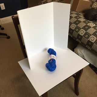
So I tried something else with the help of this blog post. I bought some white foam board: one piece that was flat and one that was tri-fold. I tried a few different locations and times of day until I settled on the mid-morning light coming in from the window of my craft room. I set up a chair, placed the flat foam board on the seat, and placed the tri-fold foam board on the back of the chair, so it could bounce the light from the window down to the yarn.
I also used some settings on my camera, including my 50mm macro lens, to help with the white balance (the blog post linked above goes into detail about suggested settings). And I did do a little post-process editing, although I found that once I had my optimal setup, the photos needed very little editing.
So it took me a while, but all of my current inventory has been re-photographed and everything in my shop is up to date. And now when I look at the overall image of the shop, I see a much lighter and much brighter image. And the background fades away, allowing the yarn to be the center focus.
This makes me want to do the same thing to my personal yarn stash so my Ravelry stash page looks nice as well. Hmm... *adding note to my "to do" list*
 |
| Here's the old picture. I still find the background interesting, but then again, the background isn't supposed to be the focus! |
 |
| And here's the new white background picture. The eye is now focused on the yarn rather than the background. |
Here's an example of a newer picture:
~~~~~~~~~~~~~~~~~~~
The content in this post was first featured in my newsletter (October 5, 2015). If you'd like to keep up to date on my designs and yarn and receive content like this right in your email inbox, make sure to subscribe to my newsletter.


